
Overview
Background
Movara Fitness Resort has as long as 20 years experience in the fitness and wellness hospitality industry. After numerous demand from past guests wishing to take Movara home with them, Michelle Kelsch—the owner—decided to begin the project Movara Home.
Role
Brand Design, UI, Usability Study, and UX practice
Project Duration
8 months
August 2020 — February 2021
The Challenge
This is my first UX project where I attempted to involve human centered design process.
Phase 1: Re-identifying Problems
Foundational Research
Joining the project in the middle with limited knowledge of UX process, I heavily relied on secondary research—that is interviewing Marketing Manager slash project owner—Khalob Freeborn over the feature requirements and characteristics of the users.
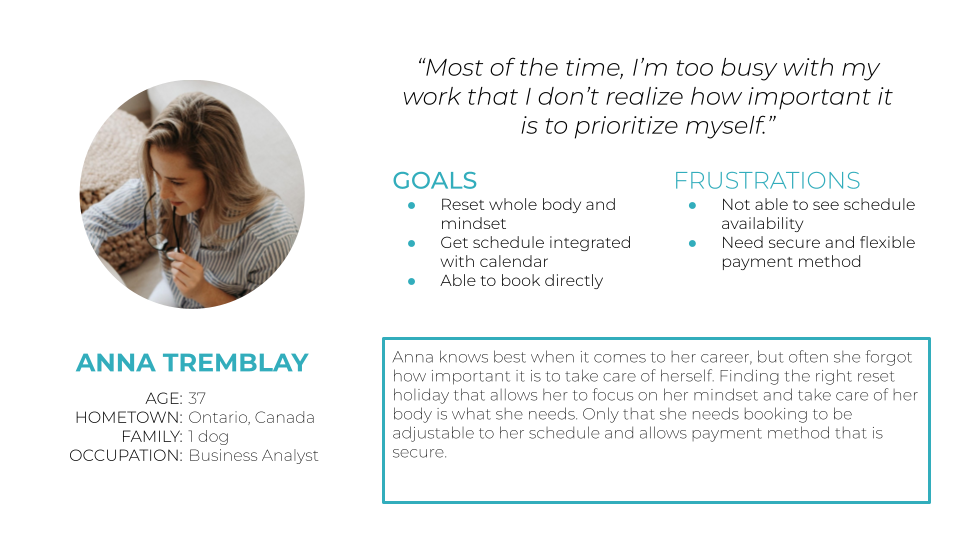
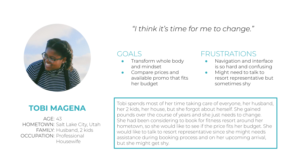
User Persona
These user personas are built based on existing user base profile in database.
Phase 2 – The Define
Problems & Hypotheses
Movara Home features were based on Movara’s owner, Michelle Kelsch’s approach of 20 years welcoming guests at Movara Fitness Resort with various fitness goals.
The main hypothesis is that ‘Movara’s proven principles’ will help users to achieve their individual fitness goal.
Business wise, our new established team aim to expand current target market (from recurring past guests) to a wider scale (new users).
Product wise, where version 1.0 built on template builder, we would like to allow current live features to be scalable by building it from scratch.
Design Requirements

User Access
Guest
View Only
Admin
Coach
Main Features
Onboarding
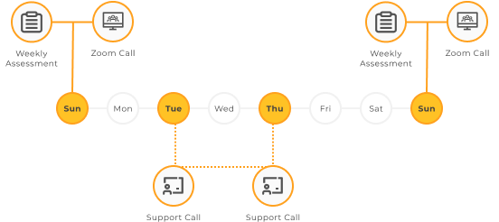
Daily Tasks
Weekly Assessment
Zoom Call Schedule
Community Page
Coaching
Simple Math
Profile and Progress Graph
My Account

User Access
Admin
Coach
Main Features
Overview
Call Schedule
Accountabiliy
Manage Program
Manage Community Page
Manage Videos
Manage Booking
Manage Users
Phase 3 – The Design
Sitemap & Information Architecture
In the middle of development, we lost 2 team members of talented developers. Before further going with the design improvement, I decided we need to create an information architecture to better understand the whereabout of product features for future team members.

Design System
Movara Home app is a living ecosystem that keeps growing. As features got wider, I decided to build UI KIT for Movara Home to keep design consistent across pages.


Phase 4 – The Testing
Usability Study
Once the product is live, I took initiative to conduct minimum effort research. For the sake of convenient, I decided to run the first usability test remotely with 3 participants.
Priority 0
To the point that) stopping users to finish task – Important and Urgent
- Daily Food Log needs to have clear instruction, how to count calories and what they should write one the daily food log.
- Daily Exercise Video needs to have clear instruction whether the video is optional and they may do other kind of exercise.
- Community Page needs divider (gestalt principle)
- Recipes has desktop view mixed with mobile
User Profile needs to edit hide/show info here.
Priority 1
Affect usability and improve friendliness – Important, Urgent, Low Effort
- Weekly Questions needs better interaction for upload flow.
- Weekly Questions body fat percentage clear information.
- Simple Math needs better context for each interaction.
Priority 2
Affect usability and improve friendliness – Important, Urgent, Low Effort
- Previous Log calendar is confusing and might need better taxonomy to describe the feature.
- Daily Videos add additional information for the back and next buttons.
- Recipes paragraph format needs more spacing.
Priority 3
Affect usability and improve friendliness – Important, Urgent, Low Effort
- Zoom Call Timeline needs timezone information
- Profile and My Account confusion, consider to change the taxonomy of My Account to Settings.
Phase 5 – The Launch
Wireframe Before & After UX
Only focus on desktop screen view
No systematic navigation
Inconsistent UI
Confusing feature function

Enable responsive layout for multiple screen size
Global navigation based on Information Architecture
Consistent UI through implementing Design System
Continuous iteration based on user feedback

Final Design Preview


Slider: Preview Mockup with Details


Takeaways
What I could’ve done better
I learnt a lot in this project. As this is my first time working so close to real users and designing their experience.
- Not conducting interview with existing user base
- Aiming for goals that have no clear metrics to measure the result
- I believe to thoroughly improve design by feature, it should’ve looked at smaller bite of feature or flow to work on — Introduce project based culture within the team
- Not conducting proper Competitive Audit specific to the project
- Not creating User Journey Map, before beginning the wireframe
- Not utilizing low-fidelity prototype to test new concept/ideas
- Testing should ideally took place before product is live
Let me know if you have feedback on this case study. Hope this case study also guide other entry level designer to see the bare minimum UX practice implementation in private owned business company.
Thank you